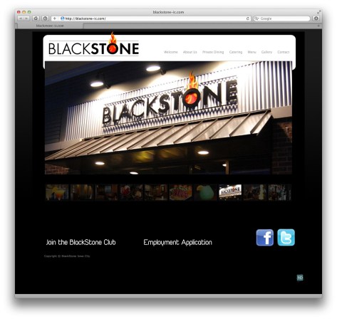
Website Review by Greg Johnson
 Introduction. There’s a lot to like about the fresh look of the Blackstone website. The site is as fresh as their food and as elegant and inviting as the atmosphere at the restaurant. So, it’s a good fit and conveys a lot about the restaurant. Because Blackstone is not just any typical restaurant, it’s appropriate that their website is equally unique. Below I’ve written about some highlights of what I think works well with the site. It’s another example of the excellent design work done by Mike Demuth, as well as a good representation of his exceptional ability to match clients with an aesthetic design that fits their business.
Rating. Overall, I’d give the site a 9.5 out of 10, taking .5 off for the use of an email link rather than a feedback form on the contact page, and for the use of a smallish photo on the About Us page. Those items are easily remedied, and I may be in the minority opinion about that email link. Feedback forms are just my personal preference. Otherwise, the site looks great! See the full review below.


About Blackstone From My Perspective. I’m not a regular customer, so I can’t speak too authoritatively about Blackstone. However, a few years back, some friends asked me to dinner at Blackstone, and I still remember the experience. The atmosphere was welcoming, inspiring, and fun. The food was great. It was the perfect setting for our meeting that night. We were having a brain-storming session about a business idea. It’s the kind of place you enjoy enough that you want to stay longer, and enjoy good conversation with friends.
About Us. The About Us page is nice. The description is well written. The photo seems to be a good quality photo and everyone is all smiles, which is important. However, the photo is small in comparison to the other photos on the site, and it looks more like a snapshot photo. I guess I would have expected a formal (but relaxed and happy) photo of the owners with a nicer backdrop.
Adobe Acrobat PDF Pages. It’s increasingly common to find PDF content on the web. In the past, this created issues for people who didn’t have the Acrobat Reader. Those who did have the Adobe Acrobat Reader still had to download documents to open then and view them. It meant being distracted from web content. In my visit to the site, the pages opened in a new tab and looked just like any other web page. I’m using Safari and the built-in Adobe reader function make the experience seamless.
Blackstone Logo. I really like the Blackstone logo, shown at the top of this page. The combination of the narrow and heavy weighted font conveys something solid and grounded along with a kind of elegance in design. It tells me that I want to dress nicely, but I don’t need to be snooty. It’s fancy without the snobbery. That’s just my take on it. The fire design from the ‘o’ is well done and suggests warmth, a stone hearth, or the traditional old-world cooking done with real fire baking. I’m not sure if that’s what it’s supposed to communicate, but that’s what I read into it.
Catering. Something I learned from the website that I’d not known before is that Blackstone offers catering. The Catering page provides just the right amount of information — enough that you know you want to call them for your next event, and the contact information to do so.
Contact. The Contact page is well done. It’s a nice touch that the Google map shows they have 26 reviews with an average of four out of five stars — high enough that you know they are good, but low enough that you know it’s not just their friends who are rating. There’s a “Tell Us How We Are Doing” link on the contact page that’s an email link. I’ve always preferred web-based feedback forms. The email links can be problematic because on most computers they launch the email client (like Outlook), and most people are using web-based email these days. So, it’s just an annoyance. If someone is using a computer that’s not their own, the owner’s email program will launch, along with all their private emails.
Education Usability. As the rest of this review indicates, the site has an excellent usability in class for courses and workshops about proper web design. This makes it a good reference and resource for those in the web design business.
Food Menus. Having all the food menus online in PDF format is a smart idea. I’ve helped some restaurants in the past with posting menus online in HTML format. The problem is that most people aren’t comfortable with website design. Even with today’s visual editing systems, PDF sill provides you with the flexibility to create something attractive without using any programming code. Most people want to print menus and put them up at work or on the refrigerator at home. So, having them ready in PDF format is an extra benefit. Printing web pages, particularly those that extend beyond one page, can be a hassle. Inevitably pages get split and often in unpredictable locations — sometimes cutting off text.
Gallery. The Gallery page of photos has been set as the home page for the site. In a WordPress installation, this would be done in the Dashboard under Settings > Reading > Front Page Displays. I usually pick a static About page or Welcome page that set’s the context for a website, but for a restaurant having the gallery is a great choice. I’ll probably use that in the future for client projects.
Mailing List. The Blackstone Club has been smartly configured to use Constant Contact. I signed up, and found the registration process very quick and easy. That helps to not dissuade people from joining. Constant Contact is on the short list of reputable and reliable mailing list services.
Menu Navigation. The navigation menu across the top offers the essentials and nothing more. Just seven links. It’s interesting to note that the Apple website has only seven navigation links at the top. Seven links for a business worth 158 billion dollars. That’s pretty good, and if it’s good enough for Apple, it’s good enough for the rest of us. I like the mouse over black background used in the navigation menu. It’s quick and easy to see.
Mobility. The site seemed to look great and function properly when viewed from my iPad or iPhone 4S. So, it passes the mobility test.
Photos. The first thing you notice about the website are the beautiful photos. If I eventually find out who the photographer was, I’ll put a credit here. Perhaps Mike Demuth does his own photography for the sites he designs (that would be cool). Whatever the case, I like that the landing page (the opening page of the site) is the slideshow gallery of photos from the restaurant. Each photo tells me something about what I can look forward to at Blackstone: colorful and refreshing drinks, artistically decorated and warmly inviting tables and booths, rich delicious deserts, fire places, fresh food with beautiful presentation, and a bar that’s fun, social, and abundant with drink options. So, if a picture tells a thousand words, then there are ten thousand words on their home page! Seriously, though, it really brings home the point that the right pictures on a website can convey so much more than words.
Private Dining. The Private Dining page really sets Blackstone apart from other restaurants and earns it a position right next to other hospitality industry event destinations in our area.
Simplicity & Elegance. It’s an interesting thing about simplicity — it can be austere or elegant. Something I like about the Blackstone website is how it has an elegant and sophisticated simplicity.
Site Design By. I like how Mike Demuth’s tiny logo is quietly and modestly placed in the lower right corner. That’s a nice touch.
Social Networking. The choice of Facebook and Twitter is a smart one. On my own site I have seven social networking buttons in each page footer, but I sometimes wonder if too many cause people to get lost. Facebook and Twitter are probably going to serve the needs of 90% of all site visitors.
__________
Update. I try to contact designers when reviewing their work. After posting the above review, I contacted Mike Demuth and we had a good exchange about the observations above. A point he made, which is a good reminder, is that sites are often setup by a designer, but subsequently managed by a business owner. With regard to the smallish photo on the the About Us page is a photo uploaded by the owners for that page. (20120214tu1849)


